Wednesday, October 23, 2013

Happy Halloween!

Its Halloween time and I decided to make some Halloween prints to sell!
First I created a Zombie who's name is "Fester Armeater" There are 2 editions of this. The first is an edition of 25, black and white. The second edition is 6 and its a brown grey color. Ill have to get a picture of it and add it to the post.


Then I noticed he was lonely and needed some friends so I created Dracula, Frankenstein, and a skeleton. 


and last but not least, my personal favorite!! Get ready for some Halloween humor; it's really punny! 


I decided to make a Halloween card. Its a zombie dog with a bone in its mouth, then on the inside it reads "I found this humerus."  The edition size is 12. 

If you see anything you like, feel free to contact me about the price. I will also be posting them to Etsy shortly, so you can keep your eyes open for that too. 

Wednesday, July 3, 2013

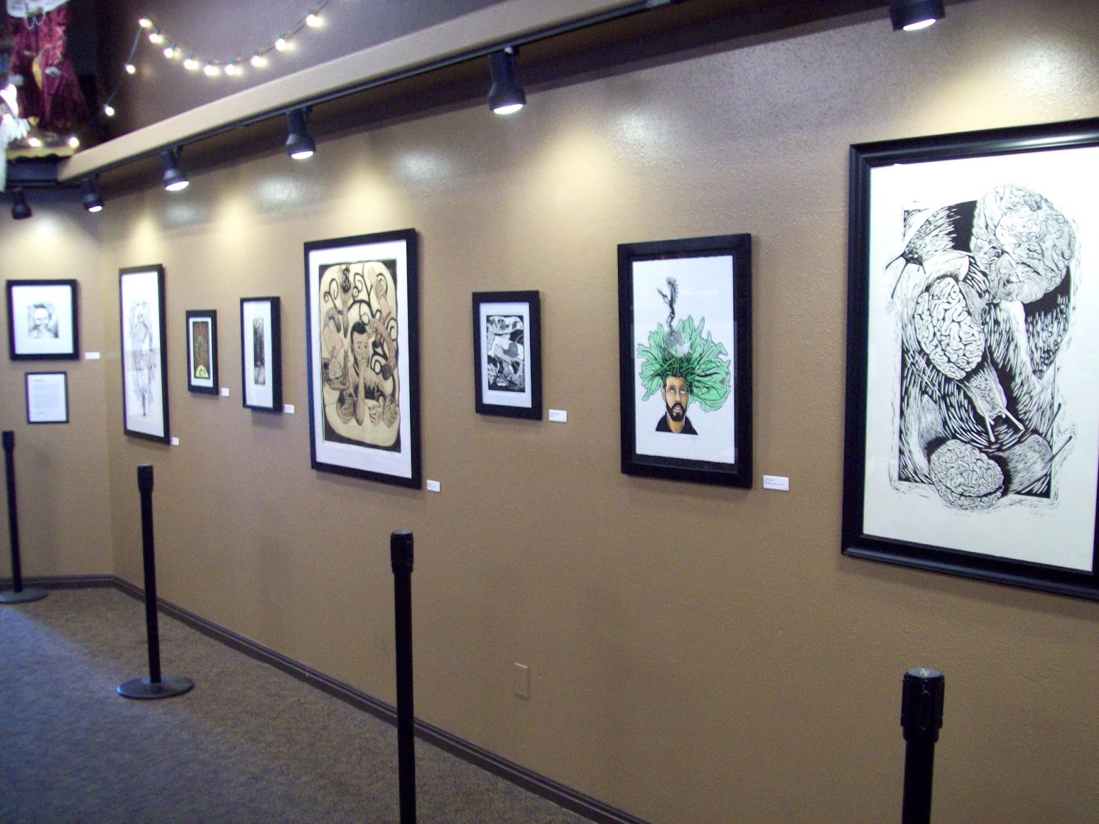
New Art Show at The Grind Coffee House

For the whole month of July, some of my prints will be hanging in The Grind Coffee House in Cedar City Utah. I'm excited for the opportunity to show my work in the community and hopefully there will be a lot of people who will pass through and see my work. So if by chance you're passing through Utah and are in Cedar City for the Utah's Summer Games, or The Shakespearean Festival within the month of July, come stop by The Grind Coffee House on Main Street, grab a cup of coffee and check out my work!


I have 9 pieces hanging.


"Less Think, Do More"


"Between Life and Death"


"Courage Even In Darkness"


"Distractions"


"Snail Shenanigans"


"Gastropods"
I also have "Self Portrait" hanging but my pictures of it came out blurry.

Wednesday, June 19, 2013

Snow College Printmaking Workshop

This past week I was able to go back to Snow College where I studied art for 3 years and take a week long printmaking workshop taught by Stefanie Dykes. She was an amazing person to meet and work with! I learned a lot, got a lot of feedback and received a lot of printmaking references and names of working printmakers.

Stefanie is the co-founder of Saltgrass Printmakers in Salt Lake Utah, which is a studio where people can come into and use the presses for their work, take classes and participate in workshops. Her link to Saltgrass is www.SaltgrassPrintmakers.org


During the course of the week we worked on a number of prints. One of the neat things she showed us this week was a simple way to keep a multi-color print registered perfectly. She called this method of registration the "Kento" registration method. From what you can see in the photo, I have a tan board with my print in the center and a strip of white running along the upper edge of the board. 


How we created these was we took a larger Masonite board, Its smooth on the front side and has a rough texture on the back. Flipping the Masonite to the back side we took 2 strips of matte board and glued them to the board with rubber cement. These two strips are for the corner of your paper so you can lay your paper down in the exact place every time. From the edge of the 2 strips of matte board we measured out 1 1/2 Inches from the top and from the side. This space is for the margin so that we have equal space around the print. Mark it and that's where you will put the edge of  print material like Sintra, Linoleum, or wood. Glue the printing material with rubber cement to the Masonite. After both the Linoleum and matte board are glued to the Masonite we coated the whole thing (minus the linoleum) with an acrylic gel medium so that when you're inking up your image, if you get ink on your board you can wipe it off easily so the ink doesn't get on your paper.

Here i'm inking my plate with my 3rd color. The registration is really really simple and pretty difficult to mess up. You just lay the corner of the paper in the corner of the matte board every time and the image should be in the exact place!


Here is my print after the 2nd color. 

 Here is my finished print. Just an non-objected print I did to explore shape, line and color. This is a 4 color print and the registration was really easy on this. Doing other multi-color prints with other various registration methods, this is the method I now prefer.


Thursday, June 6, 2013

Hanna's First Lino Print!

Another thing fun and exciting was happening this week; my 12 year old sister-in-law came for a visit and stayed with us for a week. While she was here, my wife and I went to the studio to get work done. It wasn't long before Hanna didn't know what to do and was board. I had some extra linoleum laying around and asked her if she wanted to work on a few prints to keep her occupied. She agreed and then set out to create her very first lino print.


After a while she had her image drawn on her linoleum and carved it out with my old Speedball gouges. Here she is inking her linoleum up for the first time. 


Rolling it through the press.... And....


Bam! Her first lino print!! "You so totally rock Squirt!!" -Crush, Finding Nemo.


Dude, this is an awesome first print! Nicely done Hanna!! "Give me some fin, noggin, dude." 

Progress on 8' x 4' print

Since being hired on Home Depot's freight night crew I feel like a slacker because some days I just dont feel motivated to come into the studio and print. I like my job and am grateful to have it because my bills couldn't be paid otherwise, but at the same time its difficult to work when I would rather be in the studio printing, doing what I love.

So after many weeks of not posting anything on my blog I finely have something to update! Sorry for the long wait...

Slowly I've been working on my 8' x 4' print. A print this size is more work then I originally thought, and has taken more time then I planned. Which shouldn't have surprised me because the first of art is: "Art always takes longer then you plan." Need I say more.

As I was getting ready to write this post, I looked for some pictures I took some time ago showing more of my process and how I prepared my sintra for printing, but I must have misplaced them.... So anyway. After I drew my image on the sintra with a sharpie marker, I took acrylic paint and painted the whole surface.


I paint it a color that isn't very distracting but dark enough that when I step back and squint my eyes I can get a feel for what the print will look like if I were to pull a test proof right then. Yet the paint is also light enough that I can still see the sharpie. The primary reason I do this is so that there is the contrast between what i've printed already and what I haven't. So I really like painting my matrix before I carve. If any of you were to try this let me give you a heads up; its easier to draw the image with sharpie first before you paint because i've found that the sharpie has a more difficult time going on top of the paint, it almost feels like the paint dries out the marker a little bit. So I like to get a good drawing done first before I paint it to make it easier on myself. Just a heads up. 

So now i've started to carve! I'm really excited to see it begin to take shape. Because of my schedule I haven't been able to dedicate as much time as I would like to on this piece, but 'slowly but surely' right? 


Here the first figure is carved and so is the heart and jar. 


I then worked on the trunk of the tree and the second figure. Eventually I began working on the back ground. It was a lot of straight lines..... 


It was a good day, this day I made some serious headway in my print! I love days like this! 


And this is where I am currently! I've come a long way in the past few weeks but still have a long way to go. 

Tuesday, May 7, 2013

Post Final Print

Finals are over!! And what a good feeling it is.
After I finished all of my final tests and papers I went into the print studio and did something just to relax, and actually this was a lot of fun. I had never done anything like this before but it was something I really enjoyed.

I took a scrap of sintra and just began to scribble on it with sharpie markers. I have a few with thick and thin tips, and I used them all to give me a variety of line. No subject matter, I just scribbled. It was really relaxing.  Then I began to carve it. Originally my thought was just to make a one color print but in the middle of my carving I got antsy and wanted to print. In the middle of carving is when my A.D.D. manifests itself the most so instead of pushing through the feelings of antsiness, I mixed up a few colors and made a two color abstract print.


The print size is 20" x 6 1/2" and I only printed 6 with the colors (2 of each color, Blue Yellow and Orange) and 2 just Brown and Black making 8 prints total. It was a quick print too, it only took me 3-4 hours to do from start to finish. I think they look interesting by themselves but my wife and I started putting them together to see what they would look like. 


It almost changes the image completely putting them together. This again was really fun, quick and relaxing that i've started working on a few more to play/experiment some more.

Let me know what you viewers think. I get a lot of viewers but no comments which makes me think the views are just from people who stumble across my blog instead of people who follow me or even care what I do. So I would like to hear from you. Maybe its all crap, maybe it's just "meh" and maybe you guys think its awesome. But I don't know that because you haven't told me yet...

Saturday, May 4, 2013

Klimt Monoprint

On Google+ I'm in a Printmaking community that talks about and shares our ideas and projects in the printmaking mediums, and the other day one of the community members, Ken Swinson, posted some monoprints he had done. Seeing what he had done made me excited and made me want to work on some monoprints. Thats when I my brain was stuck by lightning, I was working on a project for my oil painting class and I decided this process (monoprint) would be perfect for this project.

For those who are unfamiliar with printmaking and its processes, typically in printmaking you will carve or etch into a surface, you will roll that surface up with ink and then you run the image and paper threw a press where the ink is transferred to your paper and you have a print. In short, printmaking is like glorified stamp making. In this process you can make countless images and they will typically turn out the same. But monoprints are different. As stated in their name "mono" means one, so you can only create one print from a monoprint, making them as original and unique as an oil painting. Ill explain the process.


So for my monoprint, I took a large sheet of plexiglass and on the back of it I drew the image onto it so that I had a reference, and so it was easier to register the different colors. Then I will roll the whole plate up with ink. Because I knew this was going to be a 4 colored image, I started with my light color moving to my darker color. This is just a flat piece of plexiglass so where I dont want ink I had to remove it by scraping it with plastic scrapers, cotton balls, q-tips, and anything else that would either remove the ink completely or give me a fun texture so as the other colors over lap the image would be visually interesting.


The other thing I used to remove/give me interesting textures was use mineral spirits. When the solvent touches the ink, the ink will spread and leaves interesting marks. It was a lot of fun to play with and adds interest to the image, but always safety first, so make sure you're in a nice ventilated space. So you notice that I wiped away the ink from where the figures were, and some patterns in the dress. Here I have added the yellow ink and also the magenta ink, and you can start to see the magic of layering thin opaque inks. Where the magenta overlaps the yellow it becomes orange. And you can control how bright the colors will be depending on how thick the ink is rolled out on the plate. For example, the color here is more red-orange because the magenta is more dominate because it was thicker then the yellow. But if I wanted a more yellow orange or even a brighter orange I would use less magenta so the yellow would shine through more.


Now I added the cyan color which gave me the greens and violets. The image is more rounded now with a little more depth because of the lighter colors coming forward and the darker colors pushing the image back.


Lastly I added the black ink to add even more contrast to the image. I kept the figures blank because I knew I was going to add oil paint to them, otherwise I would have added more colors to them.


And here is my final image. After all that time scraping, rubbing, and playing with mineral spirits, I finished my print and painted the figures. I call it "Disagreement in Green" and the size is 23 3/4" x 20". Whew, could you image is picture matted and framed in a nice black frame? It would look really sharp!!